Flowdock is one of the oldest team collaboration tools on the market. Announced in July 2009, the app launched public beta in March 2010 – more than three years before Slack!
Flowdock was first designed for developers but has since become a tool for many different types of professionals. After over a decade, Flowdock closed on 1 October 2022. Many teams are now looking for new ways to work together.
Slack was designed for various types of teams since the very beginning, having launched in 2014. In 2024, it continues to evolve, with millions of daily active users and a significant base of paying customers who rely on its extensive features, from robust integrations to enhanced search and file-sharing capabilities.
At Chanty, we’ve always been curious about both – Flowdock and Slack apps. Exploring them as well as other team chat tools help us in building our own app – Chanty team chat with unlimited message history and a built-in task manager.
Give it a try!
Now let’s dive into some of the Flowdock and Slack features.
How does a “shared team inbox with group chat” (Flowdock) compare to a “collaboration hub for work” (Slack)?
Flowdock vs. Slack: quick overview
For those of you in a hurry, let’s briefly review the key characteristics of both tools.
| Flowdock | Slack | |
| Plans | Standalone$3 per month, per user Enterprise $9 per month, per user | Free: $0 (up to 90 days of messages, 10 apps & integrations, 1-to-1 video calls) Pro: $8.75 per active user/month (billed annually) Business+: $15 per active user/month (billed annually) Enterprise: Custom pricing |
| Message history limit | Unlimited | Free plan: 90 days Pro and Business+ plans: Unlimited |
| Audio/video calls | Available via appear.in integration | Free plan: Unlimited 1:1 voice and video calls Paid plans: Conference calls for up to 15 participants |
| Integrations | 100+ integrations | Free plan: 10 integrations Paid plans: unlimited app integrations |
| File storage limit | Not specified | Free plan: 5GB per team Pro plan: 10GB per user Business+ plan: 20GB per user |
| Screen sharing | Yes, via appear.in | Available in Pro, Business+, and Enterprise plans |
| Options to customize the interface | Classic and Flowdark theme, adjust the size of emojis | Custom sidebar themes |
| Conversation threads | Yes, conversations are based on Threads | Yes, Threads are just a specific feature |
Flowdock vs Slack: pricing
First, let’s state the obvious. Slack does have Freemium version, while Flowdock doesn’t. You can use Flowdock without paying for it only if you have up to 5 people in your team. As an option, you can try the tool for free, for 30 days.
Here’s Flowdock’s pricing as of April 2019.
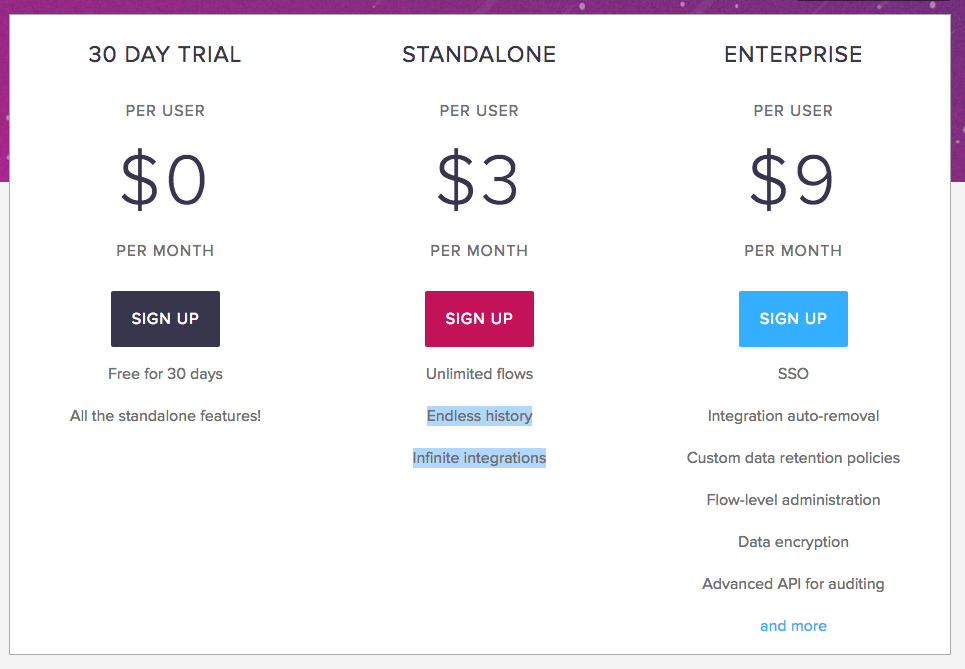
Flowdock pricing.
At the same time, Flowdock’s paid plans ($3 and $9 per user, per month) are significantly cheaper than the ones Slack offers ($7.25 and $12.50 per user, per month).
Here’s Slack’s pricing as of April 2019.
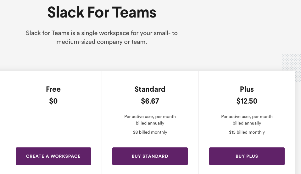
Slack pricing
As of October 2024, Slack offers a Free plan with limitations, including a 90-day message history and a 10-app integration cap. For more features, the Pro plan costs $8.75 per active user/month (billed annually), while the Business+ plan is $15 per active user/month, with custom pricing for larger enterprises.
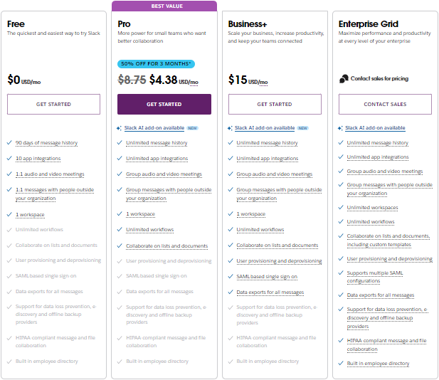
If you consider choosing Slack’s Freemium plan, bear in mind it has some tough limitations, such as 90 days message search limit.
Flowdock vs Slack: signing up and onboarding
Signing up is fast in both tools. But in Flowdock it’s like super-fast. At least, if you sign up using Google, like me. Then you’ll have some of your personal information pre-filled.
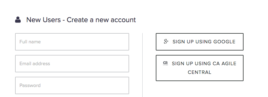
Flowdock sign up form
I didn’t even have to upload an avatar. Flowdock fetched my Gravatar, based on the email address.

Flowdock automatically fetches a Gravatar
Flowdock doesn’t offer to add colleagues to your workspace when signing up. Also, I noticed no product tour in the tool. The same is true about Slack (as of April 2019). Instead, the tool offers some onboarding tips with prompts that appear in channels while exploring the app.

Onboarding tips in Slack
In 2024, signing up for Slack remains quick and user-friendly. New users can join for free by entering their email at slack.com, creating a workspace, or joining an existing one through an invitation. Slack’s setup process guides users through choosing a workspace name, customizing settings, and inviting team members.
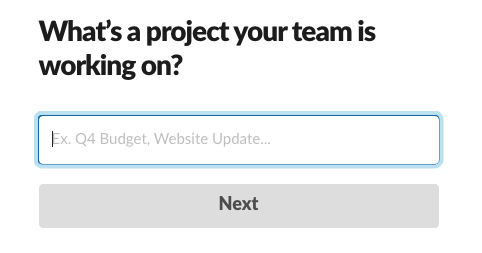
Creating a channel in Slack during a sign up
In a word, signing up to Slack take just a bit longer, but it’s actually fast in both tools.
Flowdock vs Slack: user interface and user experience
The interfaces of both tools look much alike.

Comparing Flowdock and Slack interface (as for 2019)
The Flows (Channels) are listed on the left while messaging and collaboration space is on the right. There’s also a collapsible panel for different features.
As for customization options, the left panel in Slack can be adjusted in any color you choose.
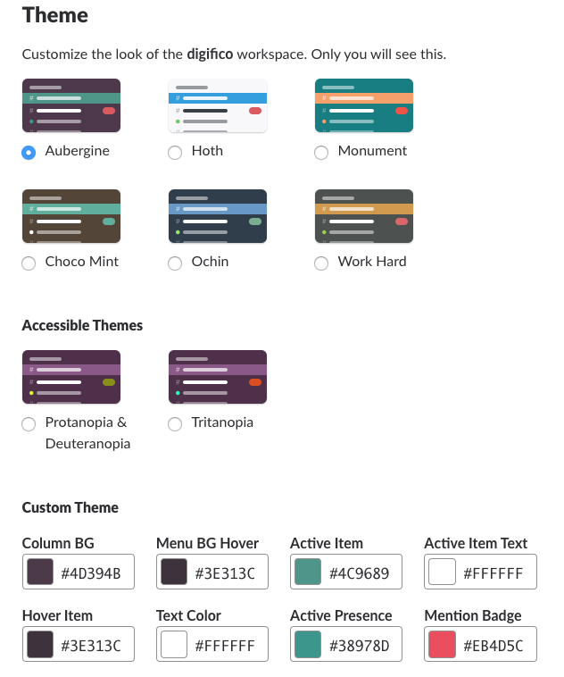
Custom sidebar themes
In Flowdock, only two themes are available – Classic and Flowdark.

Switching a theme in Flowdock
Both tools seem quite intuitive to use, but Slack is probably a bit ahead of the game when it comes to user experience.
For example, when making a call, it’s quite clear how to do it in Slack. You should press the ‘hand receiver’ button.

‘Call’ button in Slack
But when I just signed up to Flowdock, I actually got puzzled: how do I set up a video meeting here? There is no ‘call’ button or anything like it. I had to google my question to learn that the feature is realized via a slash command.

Entering a slash command in Flowdock
How am I supposed to guess about it? This lead me to a thought that Flowdock can do better when it comes to UX.
Flowdock vs Slack: communication
Threads
There are some significant differences when it comes to chatting in both tools.
The most important one is that communication in Flowdock is organized in threads that preserve context for each discussion. Conversations are color coded for users to identify a topic and jump back into conversations.

Replying to a Thread in Flowdock
In Slack, threads remain optional, allowing users to keep conversations organized within channels like chat rooms centered around specific topics. Threads help manage discussions that diverge from the main topic, creating a more focused, clutter-free channel experience. In 2024, Slack has refined threads to enhance usability, allowing users to follow or unfollow threads more easily, receive relevant notifications, and maintain better control over ongoing discussions.

Threads in Slack
However, threads are only available within public and private channels and do not extend to direct messages. Unlike Slack, Flowdock does not offer a threads feature within private conversations, limiting threaded discussions to Slack’s platform.
In the long run, when choosing the tool, be sure to learn whether it is a thread-based or not. This might play a crucial role in your team chat communication.
Flows/Channels
In many other aspects, the communication feature in Flowdock and Slack is organized by the same principle.
The Channels in Slack have a similar function to Flows in Flowdock. Also, Direct Messages are basically the analog of 1-1s.

The left panel in Flowdock
At the same time, I noticed no group conversations in Flowdock.
Slash commands
Slash commands are provided by both tools. There’s a special button for initiating them in Flowdock, while in Slack you should enter ‘/’ to enter a command.
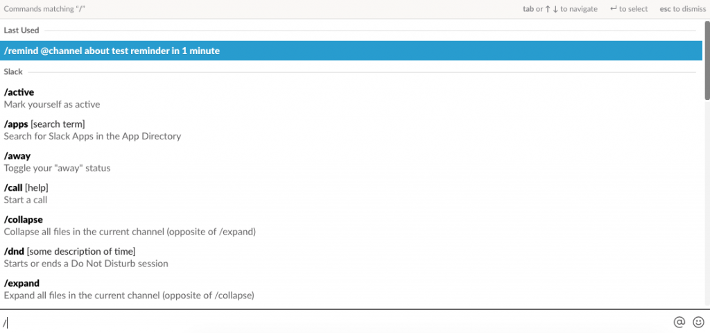
Accessing commands in Slack
Slash commands act as shortcuts for specific actions – whether it’s writing an away message or changing your status.
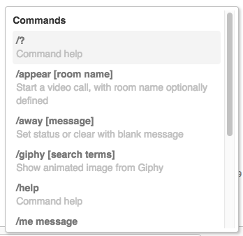
Accessing commands in Flowdock
Email your updates
Flowdock has a feature that no other app has: every flow has an email address. You can copy it when emailing people outside your Flowdock so your team can see who you’re communicating with.
Moreover, you can start an email to your colleague instead of a 1-to-1 conversation in Flowdock interface.

Flowdock vs Slack: notifications
Both tools provide multiple ways for customizing notifications – for web, desktop and mobile.
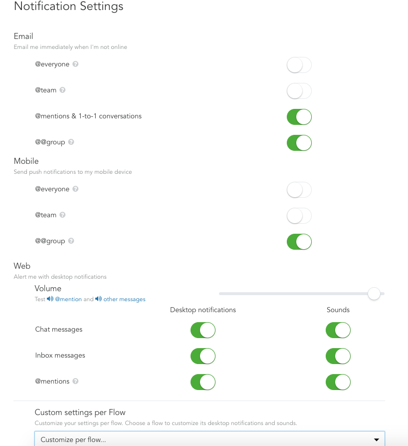
Notification settings in Flowdock
Having channel-specific settings and keyword alerts, Slack’s notification feature seems a bit more advanced to me.
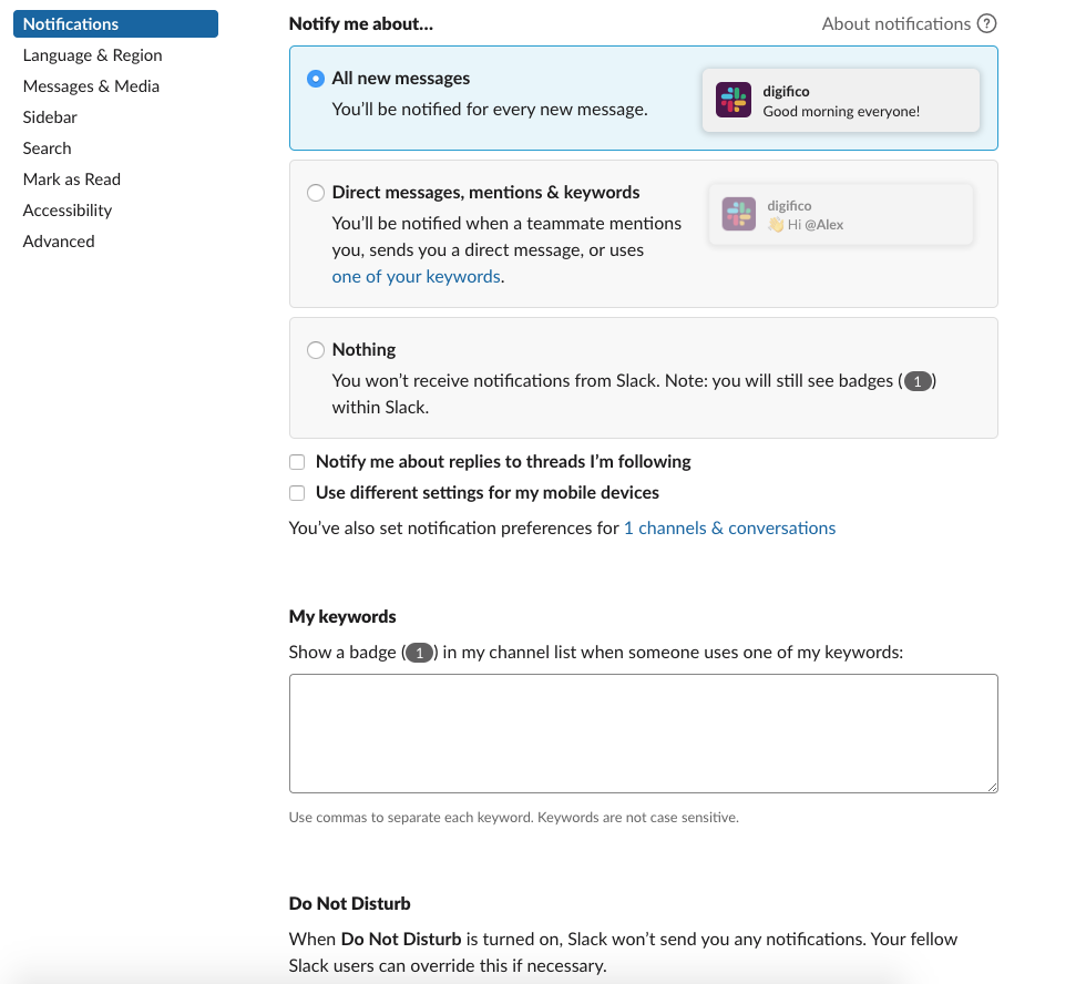
Notification settings in Slack
Even with numerous features, staying focused can be a challenge if @mentions aren’t used thoughtfully. In a large team with active channels, it’s easy to get overwhelmed by notifications.
But I guess it’s not just a problem of Flowdock and Slack. It seems that developers of all collaboration tools are facing a challenge in light of the global growth of information.
Flowdock vs Slack: search
Slack’s search seems more advanced to me for two reasons.
First, each time I search in Flowdock, I do it within a specific Flow only. But what if I don’t remember who did I send (or receive from) a message? Then, I would need to perform a search in each separate Flow, which might take much time.


Flowdock search within specific Flows
In Slack, however, I can search through the whole Workplace.

Search box in Slack
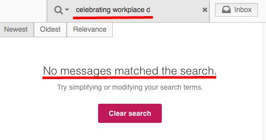
Also, Slack performs search within the content of the documents. Long ago, I shared an e-book ‘50 ways to improve team communication’ in PDF. So I typed the name of a chapter ‘Celebrating workplace diversity’ to check whether I can find it via search. And it worked!

I tried the same experiment with Flowdock. But unfortunately no use. Flowdock doesn’t seem to search within the content of your files.
Flowdock vs Slack: file sharing
Drag and drop
Need to share a file from your computer? Keep in mind, Slack has a bigger file upload limit.
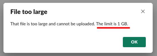
In Flowdock, the single file size is limited to just 200MB.

Using file management services
Slack works with files shared from popular services like Dropbox, Box, and Google Drive. As soon as you add an integration, you can share files right within your messaging box.
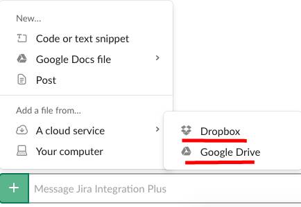
Sharing a file via third-party services in Slack
In Flowdock, however, there are no file sharing services among the list of integrations.
You can connect the tool to Google Drive and some other tools via Zapier, though.
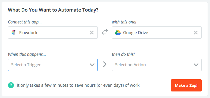
Connecting Flowdock and Google Drive via Zapier
File storage limit
I didn’t find any information about file storage limit in Flowdock. In Slack, it’s 5GB for a team in Free plan. 10GB and 20GB per user are available in Pro and Plus plans.
Flowdock vs. Slack: voice and video calls
First, let’s state the obvious.
Unlike its competitor, Slack has a built-in call feature. In Flowdock, the audio and video meetings are available via integration with appear.in. This can create some additional expenses for users.
The thing is Freemium plan in appear.in is designed for only 4 participants. If you need to have a conference with, let’s say, with 4+ of your colleagues, you’ll need to buy Pro plan, which is $9,99 per user, per month. Providing you are already paying $3 per user, per month, this might raise your expenses up to $12,99 per user, per month! In a word, using the feature will cost you a pretty penny.
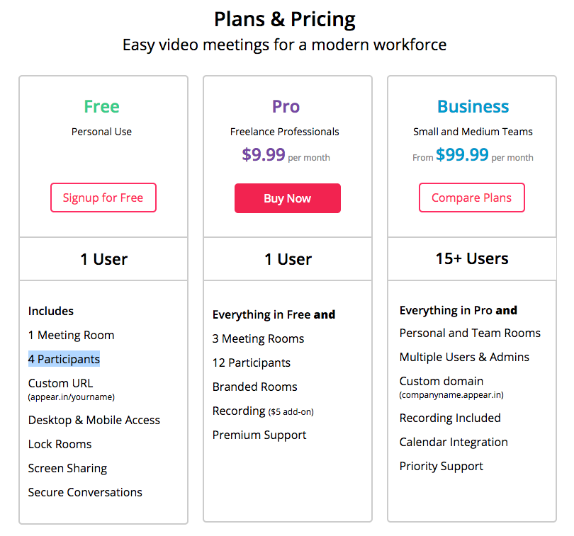
Appear.in pricing as of April 2019
At the same time, I have no complaints about the quality of calls in appear.in. We’ve tested it recently and were quite satisfied. By the way, screen sharing is available within Free plan in appear.in.
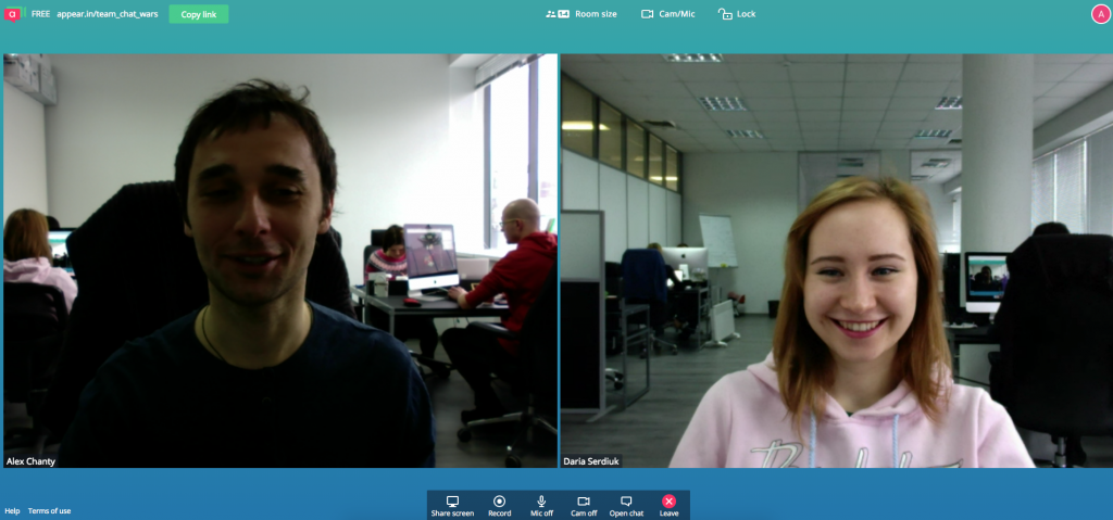
Chanty team is testing calls in appear.in
Video calls in Slack are also limited to one-to-one meetings, but only in the Freemium version. In paid plans, there can be a total of 15 participants within your call.

Chanty team is testing calls in Slack
Slack vs. Flowdock: integrations
As we know, Flowdock provides unlimited integrations with third-party apps. However, there are only 100+ of them while Slack has 1500+.
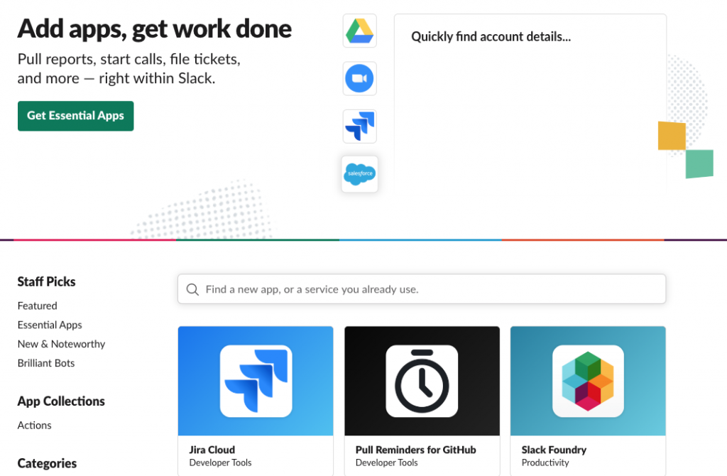
Slack’s integrations page
I tried to connect Jira to Flowdock just to test how the integrations are working.
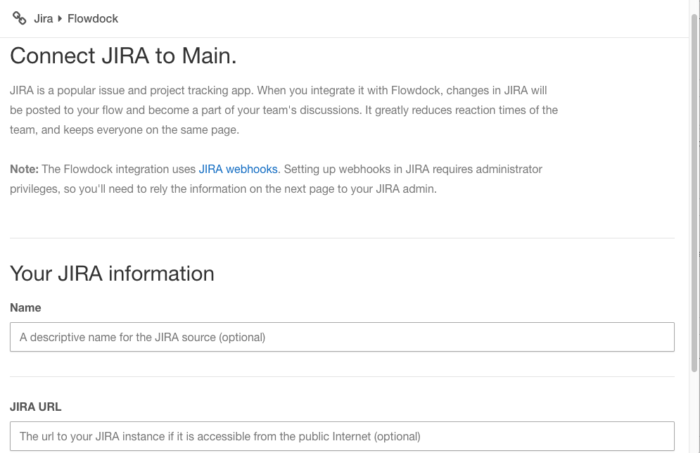
Everything went smoothly with the updates coming to the Flowdock team integration inbox. This is the feature I’ll describe below.

Jira’s notification in Flowdock’s integration box
Integration Inbox in Flowdock
Integration inbox is the unique feature of Flowdock. Basically, it’s a space for the updates from each of your apps.
You can push anything into the team inbox, be it by email, RSS feeds, tweets. Or you can use some of CA Flowdock’s out-of-the-box integrations – GitHub, Zendesk, etc. Here’s how team inbox with updates might look like.
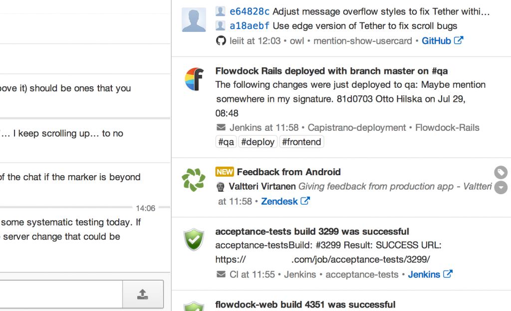
Team inbox in Flowdock.
Image source
Along with Threads, Team inbox is the key feature of Flowdock. So be sure it suits your needs before buying a tool.
Flowdock vs Slack: help center
In general, I liked Slack’s ‘Help’ section more, mainly because it has the search feature.
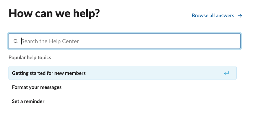
If I want, let’s say, to change my display name, I just type in a question and receive an answer. I might even find my question in the drop-down list.
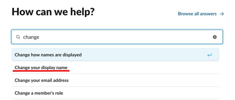
Help Center in Slack
I didn’t notice the same feature in Flowdock. To learn how to delete a flow I should browse quite a lot of content until I find out how to do it.
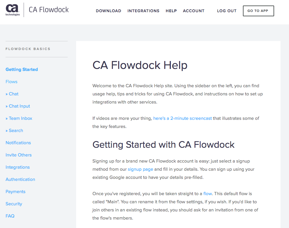
Flowdock Help page
Also, Slack has a bot to give answers to your questions about the tool. If you don’t see it in the left panel, you can just type ‘Slackbot’ in the search box to find it.
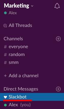
Slackbot in Slack’s left panel
You can ask a question and get an automated answer, which will be relevant (hopefully). When I typed in ‘delete channel’ in the message box, I got the link to Slack Help Center.
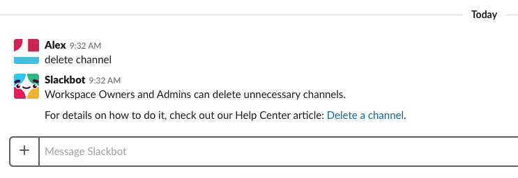
I didn’t notice any Help Bots in Flowdock, though.
Wrapping up: Flowdock vs Slack for business
I’ve briefly compared some features of Flowdock and Slack. Let’s review the key messages below.
Pricing: When it comes to pricing, Slack tends to be more expensive. The Pro plan is priced at $8.75 per active user per month, which can add up quickly for larger teams. In comparison, Flowdock offers a more affordable option with their basic plan priced at $3 per user. However, Slack does offer a Freemium version, which is great for smaller teams or those just getting started, while Flowdock lacks a free tier.
Signing Up and Onboarding: Both platforms offer relatively quick and simple sign-ups, but Flowdock seems to have a faster start. Slack, on the other hand, has improved its onboarding process by introducing a guided product tour in 2024 to help teams get up to speed with all its features. Flowdock lacks this feature, which could make Slack a bit more user-friendly for first-time users.
Communication: When it comes to messaging, Flowdock is centered around Threads, which are similar to Slack’s channels but with a different organization style. Slack’s Channels serve as a more flexible way to organize conversations by team, project, or topic. As for direct messaging, both platforms support 1-1 chats, but Flowdock’s direct messages are often referred to as Direct Messages (DMs), just like in Slack.
Notifications: Both Flowdock and Slack offer customizable notification settings for desktop, mobile, and web. However, Slack stands out with its advanced keyword alerts and channel-specific notifications, giving users much more control over which notifications they see and when. This makes Slack particularly user-friendly for managing notifications across different teams and projects.
Search: In terms of search functionality, Slack shines with its workspace-wide search that extends across messages, files, and even integrated apps like Google Drive and Dropbox. This makes finding content across your entire workspace much easier. In contrast, Flowdock’s search is more limited, primarily focusing on messages within individual Flows and lacking the ability to search content within documents.
File Sharing: When it comes to file sharing, Slack offers a more generous upload limit of 1GB per file, which is much higher than Flowdock’s 200MB limit. Additionally, Slack integrates with popular services like Dropbox, Box, and Google Drive, making file sharing seamless for teams using these tools. Flowdock, on the other hand, doesn’t support these integrations, which could limit its usefulness for teams heavily reliant on external file storage services.
Voice and Video Calls: Another major difference is in the area of voice and video calls. Slack offers built-in tools for both, making it easy to hold virtual meetings. However, if you want to organize meetings with more than 5 participants using Appearance.in, you’ll need to pay at least $9.99 per user per month. Flowdock, however, lacks any built-in voice or video calling features, so teams using Flowdock will need to rely on third-party apps for these needs.
Integrations: A distinctive feature of Flowdock is the Team Inbox, where all your integration updates are stored in one place. In Slack, integrations are typically organized into specific channels, making it easier to keep track of updates from various services. While Flowdock’s Team Inbox is a unique approach, Slack’s channel-specific integrations give more flexibility and organization for teams using many tools. In addition, Flowdock’s list of integrations is smaller compared to Slack’s comprehensive directory, which supports a vast range of third-party applications.
Help and Support: For teams that need support, Slack’s Help Center is enhanced with a robust search feature, making it easier to find answers to your questions directly within the tool. Flowdock, while offering support, doesn’t seem to have the same level of easy access to help resources, which could be a bit of a hurdle for teams that rely heavily on customer support.
That’s all for now. We’d love to hear your thoughts on Flowdock and Slack in the comments below.
If you’re looking for a simple, feature-rich chat app for your team, Chanty is a great choice. It’s designed to be simple to use and offers features like unlimited message history, built-in task management, audio and video calling, and more, making it a great choice for teams looking for a straightforward chat tool.
Feel free to book a free demo to see if it’s right for your team!
This article was originally posted in April, 2019


